Resources
‾‾‾‾‾‾‾‾
The QuakeCoRE logo is the most commonly seen element of our identity and its use must be in accordance with these guidelines. Any other use must be approved by QuakeCoRE in advance of production. The guidelines below give advice on how to use the QuakeCoRE logo.
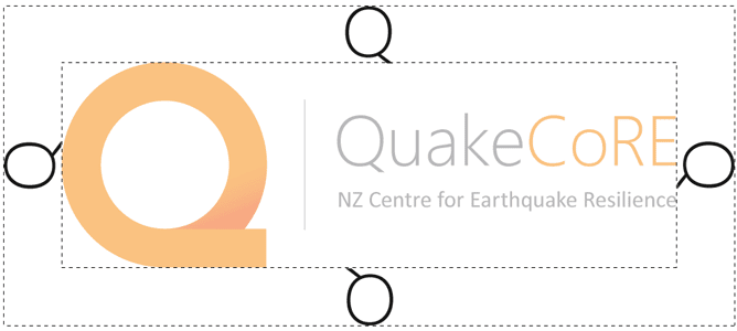
Exclusion zone
To ensure our logo is always clearly visible, it has an exclusion zone. This is to create clear space around our logo, ensuring its legibility and authority. When placing the logo into a design, the minimum exclusion zone must be used (the height of the “Q” from "Quake").
Size and
placement
The logo must be legible and scaled appropriately for the application:
• Minimum 15 mm height for digital use
• Minimum 10 mm height for printed use
Background
colour
Use the logo on a white background where possible. If necessary to use over a colour or image, ensure that you select an area that allows the logo clear visibility by selecting a quiet area of an image with light colours. Please email us for a different version if you need to place it on a dark or highly coloured background.
Font
QuakeCoRE's primary font is Roboto.
Roboto can be downloaded for free here.
Where Roboto is not available Arial is the secondary font of choice.
Colours
Below are the QuakeCoRE colour values in RGB, CMYK and Hex-code.
C0 M51 Y99 K0
#F6921E
C1 M72 Y98 K0
#F16B22
C52 M43 Y41 K7
#808184
Download
QuakeCoRE Logo
The download contains rgb png files of the QuakeCoRE logos. Please email us if you require a specific format or have any questions.
QuakeCoRE PowerPoint Template
The download contains the QuakeCoRE PowerPoint template (.pptx).